Hey! How are you? Hope so.
This post is an analysis of the Firewatch game, which I had recommended in the Tip #01 post. Through observation and deduction I talk about techniques, art, composition and much more about Firewatch Ambient Art.
Landscape
In the landscape, the textures are clear and harmonious, using "Normal Map" with few and smooth details, avoiding a rough look. Observing the color of the soil, and comparing it with the color of the grass, it seems that the landscaping material does not have the much used function for the vegetation to follow the color of the soil.

Grass
Although some games with this look use patterned grass, Firewatch uses "flats" with opacity masks to save triangles, this is noticeable in the small serrations in the contour of the grass. The game uses solid colors with little variation, between light green, dark and a little yellow in the vast majority of the scenario, with a slight gradient from the base to the top.

Rocks
Although the stones have beautiful texture details, they are very simple and don't receive great compositional details around them.

With a very uniform color grid, most rocks in the game vary between shades of gray.
Note: The yellowish color in the image below is due to the lighting at the time of recording, which was at sunset

Something very interesting is the use of special stones, (Apparently "planes") to hide areas unsuitable for the player, in the video it is possible to see, hidden between the bushes and two stones, the "plane" open and floating, a theory which can be confirmed with a good observation.

Some objects are widely used, such as the stones shown in the image above, it is possible to notice that some larger ones have textures with low resolution, as their appearance is very similar to the other smaller stones, leading to the assumption that they were scaled to the point of lose some quality, something common, but that must be done with caution, so as not to exceed the limit used in Firewatch.
Constructions
The constructions have a very pleasant style, but they lose a little in the detail, having a lot of overlapping of meshes in their construction, and/or not a justifiable connection point (ropes, nails, angles, screws...), as can be seen easily on the stairs. But it is important to remember that this is all common in this category of art.

Textures
The game's texture quality is great, especially considering the year of production. Textures rich in details, conveying the idea of special care with them. When compared to what can be done in Substance Painter, we can deduce that with a few layers of solid colors and dynamic masks we can achieve the results of many of Firewatch's textures.
Still comparing with the use of Substance, the textures of Firewatch, would not use the Bake function, since they do not consider the corners and the occlusion, in most objects.
Almost all the textures of the scenery are worn out, giving the idea of something old or well used, something that matches the game's proposal very well.
There are few textures that seem to be in low resolution, or with some kind of visual annoyance. It is worth mentioning two textures that could be better.
The stone that appears to be too large in scale.
Fence wood that has a normal too coarse.
It is worth mentioning here again, as stated in the video, it is important to realize these "flaws" and understand that solving them, not necessarily, would make Firewatch a better game. It is necessary to understand that the visual aspect of a game is just one of its parts, and depending on how good your proposal is, even a more simplistic design will still have its merit, games like Minecraft, Unturned, Roblox are good examples of this.
Props
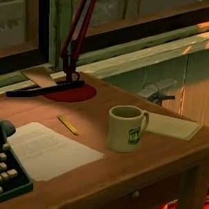
In the watchtower (home of the protagonist), we have several objects, these that make up the scene, have gained due attention:
The mess that represents everyday life;
Cardboard boxes that demonstrate storing supplies;
Notebooks;
Cleaning items;
Books;
A messy bed;
Bone jaw of some animal;
First aid kit;
Pots;
Plates;
Canned;
Cereal box;
Pencil;
Notepad;
Scotch tape;
Disorganized things;
Dirt;
Old and new items;
Drawers ajar due to malfunction or carelessness;
Small items, such as pencils and paper, scattered on the tables;
All of this is VERY important to create realism and life for the scenario, all of this indirectly tells a story.
This is the analysis of the Firewatch game, remembering that everything here is speculation and I don't intend to defame or harm anyone, just trying to identify development techniques and practices, and of course, a lot here is my opinion, so leave your point of view in the comments! And until next time!
Alisson Almeida - Environment Artist


Comentarios